When you think of an iconic logo, what comes to mind? The striking yellow of the ubiquitous golden arches? The almost audible swoosh of the Nike tick? Or maybe the crisp curve of a half-bitten apple?
We live in an age of logo-mania: mascots, monograms and mottos. But do we know the story behind any of these infamous designs? We've retraced the history of famous logos to find out how exactly they came to be...
Nike Wings
Designed by: Peter Moore
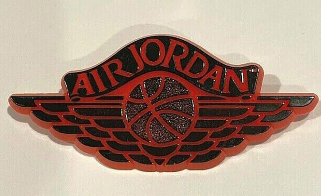
Legendary designer Peter Moore could have multiple entries on this list, but we settled upon his first claim to fame. True sneakerheads know that prior to the 'Jumpman' logo, which is synonymous with Air Jordan's today (also oft-credited to Peter Moore), there was 'Wings'.
As legend has it, Peter Moore watched a child be gifted a captain wings badge by a flight attendant as he boarded a flight. He then asked for his own badge, scribbled out the wings on the back of a napkin, added a basketball and voila!
The logo was more than just an image. It fed into the air-borne narrative that Nike masterfully cultivated: with a pair of Air Jordan's you can 'take flight' just like Michael.
Ferrari shield
Designed by: Francesco Baracca & Enzo Ferrari
The Ferrari shield was born from a chance collision between Enzo Ferrari and fellow speed-demon Francesco Baracca—or rather, his parents.
Francesco Baracca was a Major and pilot who tragically lost his life in the First World War. On the bodywork of his fighter, Baracca had painted a black prancing horse with its tail downwards—a symbol of courage. Following one of his victories, Ferrari met Mr and Mrs Baracca who told him of their late son's personal emblem. The pair suggested that if Ferrari were to paint his vehicle with the same, it would bring him good luck. Enzo Ferrari took their advice. The infamous Ferrari shield made its debut mounted on the Ferrari 125 S in 1947, now with an upward turned tail and emblazoned on top of a bright yellow background in honour of Modena, Ferrari's birth town.
Today the prancing horse is a symbol of excellence in engineering, luxury and class—so long as it's not going too fast for you to see!
Paul Smith Stripe
Designed by: Paul Smith
The tale of the Paul Smith stripe begins, as these stories so often do, with a happy accident. In the 1970s, working out of his first shop in Nottingham, Paul Smith began experimenting with different coloured threads using hand-held windings. The resulting colourful pattern is what we know today as Paul Smith's signature stripe.
Today the stripe is often reserved as a certification for premium fabrics. However, it is also an embodiment of playful innovation used to revive classic pieces with a cheeky bit of character. The classic 40-coloured stripe has been adapted into different tonal palettes and forms over the years, perhaps most notably emblazoned on a Zebra! The classic motif has stood the test of time and acts as an instant identification of Paul Smith tailoring.
Recycling logo
Designed by: Gary Anderson
22nd April 1970 marked the first Earth Day in the US. In celebration, students from around the country were encouraged to enter a competition to produce a symbol for future use on products made from recycled paper. Gary Anderson, a 23-year-old urban design student, submitted to the competition. His entry, which apparently took no longer than a day or two to design, comprised 3 arrows folded to command a triangular shape that loops continuously. Needless to say, he won!
Anderson received around $2000 for his efforts and his design was gifted to the public domain. Anderson went on to make great contributions to urban design and planning. The symbol is likened in recognisability to that of giants like McDonald's and Coca Cola, but its impact runs far deeper. The simplistic design played a big role in bringing the concept of recycling into the public eye and continues to educate people on how best to responsibly dispose of their waste.
I love NY
Designed by: Milton Glaser
In 1977, graphic designer Milton Glaser was tasked with a rather unusual commission: to brand a city. New York City was suffering from an economic lull and it was decided an effort to draw in tourism was needed. The story goes that Glaser sketched the design on an envelope in the back of a taxi.
Ironically, Glaser thought his design would be a fleeting campaign, "gone in a few months". How wrong he was.. These days you can't walk past a tourist shop without seeing an adaptation of the iconic logo. Though its prevalence baffles Glaser to this day, he describes its enduring place in pop culture as "a great pleasure". Disappointingly, Glaser never directly profited from its unanticipated success. However, his work was acknowledged with multiple awards. Notably, Glaser was the first graphic designer to ever receive the National Medal of the Arts award.


